Alex Shipillo, senior marketing manager at Influitive, and I recently created a webinar for Demand Gen Report on the topic of marketing analytics secrets. One of the secrets that Alex and I like to promote is cohort analysis. Despite its geeky name, cohort analysis is a very cool standard B2C marketing metric where a group of transactions from a period of time are analyzed for trends. In B2B marketing with longer sales cycles, a direct sales organization, and more complex transactions, it’s best to measure your cohort as a group of leads from a period of time and measure what happens to those leads.
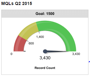
A typical cohort analysis reviews the volume of leads by month. If you’ve done your reverse funnel, you will know your lead targets by month and you can see how the leads are trending month over month and whether you are meeting your volume goals. You can use a gauge like this to measure your progress against a goal.
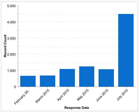
And you can use a bar chart like this to see how your lead volume is progressing.
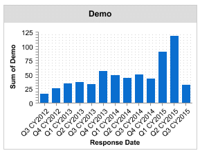
Then you can look at trends in stages such as this chart which looks at demo trends in sales. This chart compares quarterly cohorts versus monthly. Sometimes the data makes more sense to review on a quarterly basis rather than monthly. Note that the Q3 number is low but it’s probably just a partial quarter so the volume is going to be lower due to the timeframe.
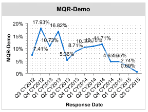
Here’s something we see a lot in fast growing companies: When the volume of leads goes up, the conversion rates often go down. Then the sales and marketing team can work to refine the programs so that the conversion rates go up again. This chart shows the conversion rates by quarter for marketing qualified response to a demo stage.
All of these charts show measurement of a cohort of leads and how they are moving through the funnel. You can use charts like these to understand the health of your marketing and work to make your marketing better and better.
